
Redesign Waste 4 Change
First project when bootcamp
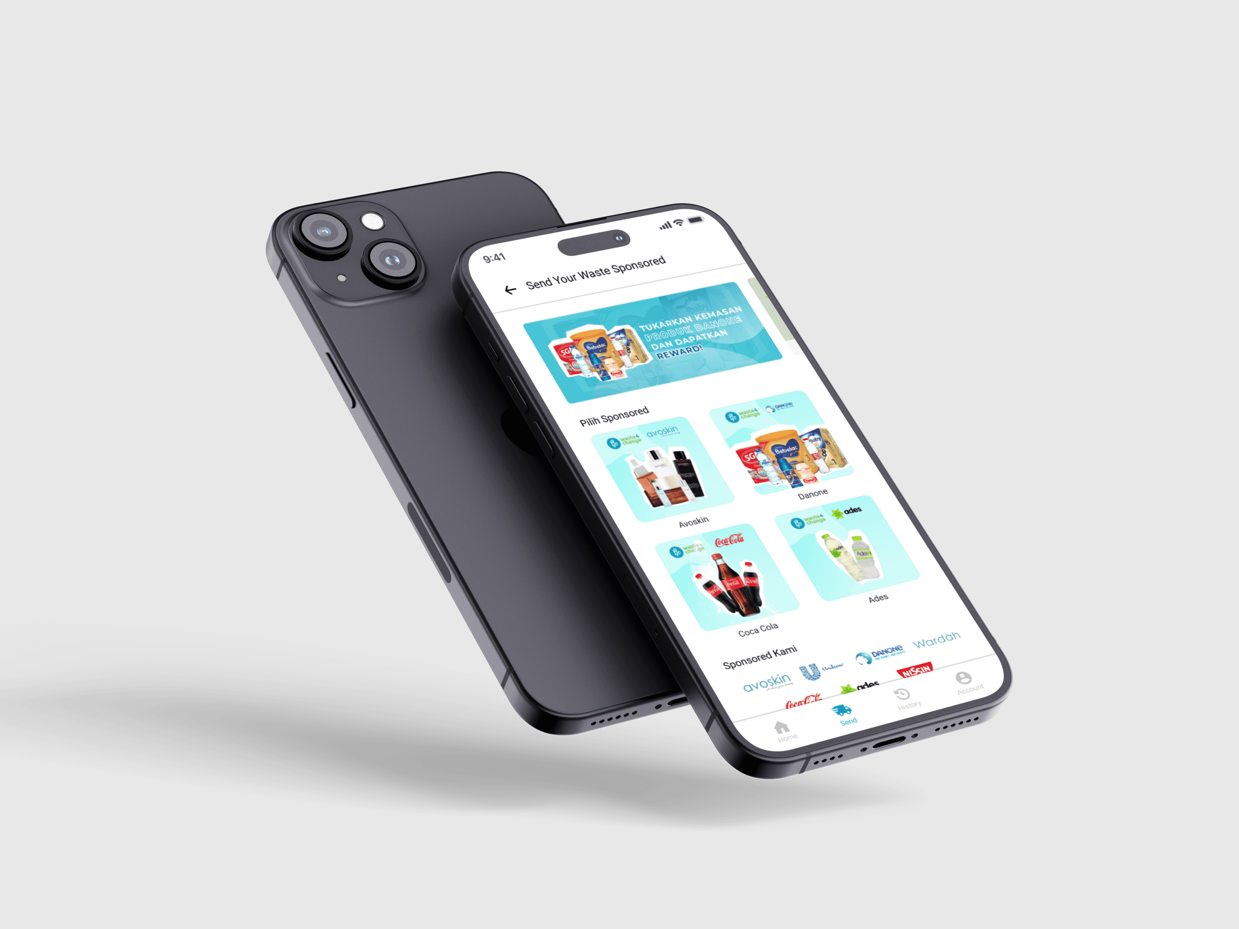
Client
Waste 4 Change
Service
UI/UX
Year
2021
Project Overview:
Waste4Change is a company that provides solutions for responsible waste management. Waste4Change was first established in 2014, which started from a discussion between two companies in the waste sector. Package delivery can be sent by registering and filling in the Waste4Change web.
Problem Statement:
Waste4Change gets a lot of questions from users asking how to use web apps and difficulties in sending packages due to problems in API integration sometimes caused by miscommunication in the flow and copywriting on the page. For this reason, W4C presents the RWU (Recycle With Us) service with several programs such as SYW (Send Your Waste) both Regular and Sponsored Programs.
Objective:
Looking at the background, it can be concluded that there are several components/features on the web that can be improved or created, including:
Recycle Landing Page.
Delivery Page.
Point Rewards Page.
Logistics partner API/Payment transition Page.
Design Process:
Used the Design Thinking approach to solve this problem. To practice design thinking we followed the below process.
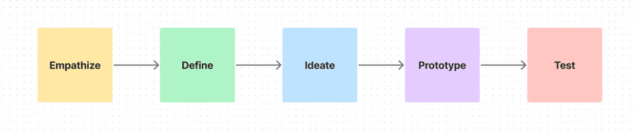
Empathize
This step aims to help designers find out the views & needs of their target users with research before defining the problem statement and doing ideation.
In this case, it has been explained in the background and objectives about user problems when using the Waste4Change web, where the needs of the target users are on web usage and delivery.
Define
The main objective at this step is to define user problems from the results of empathizing and making How Might We an opportunity. Therefore, we create several pain points for users as follows.
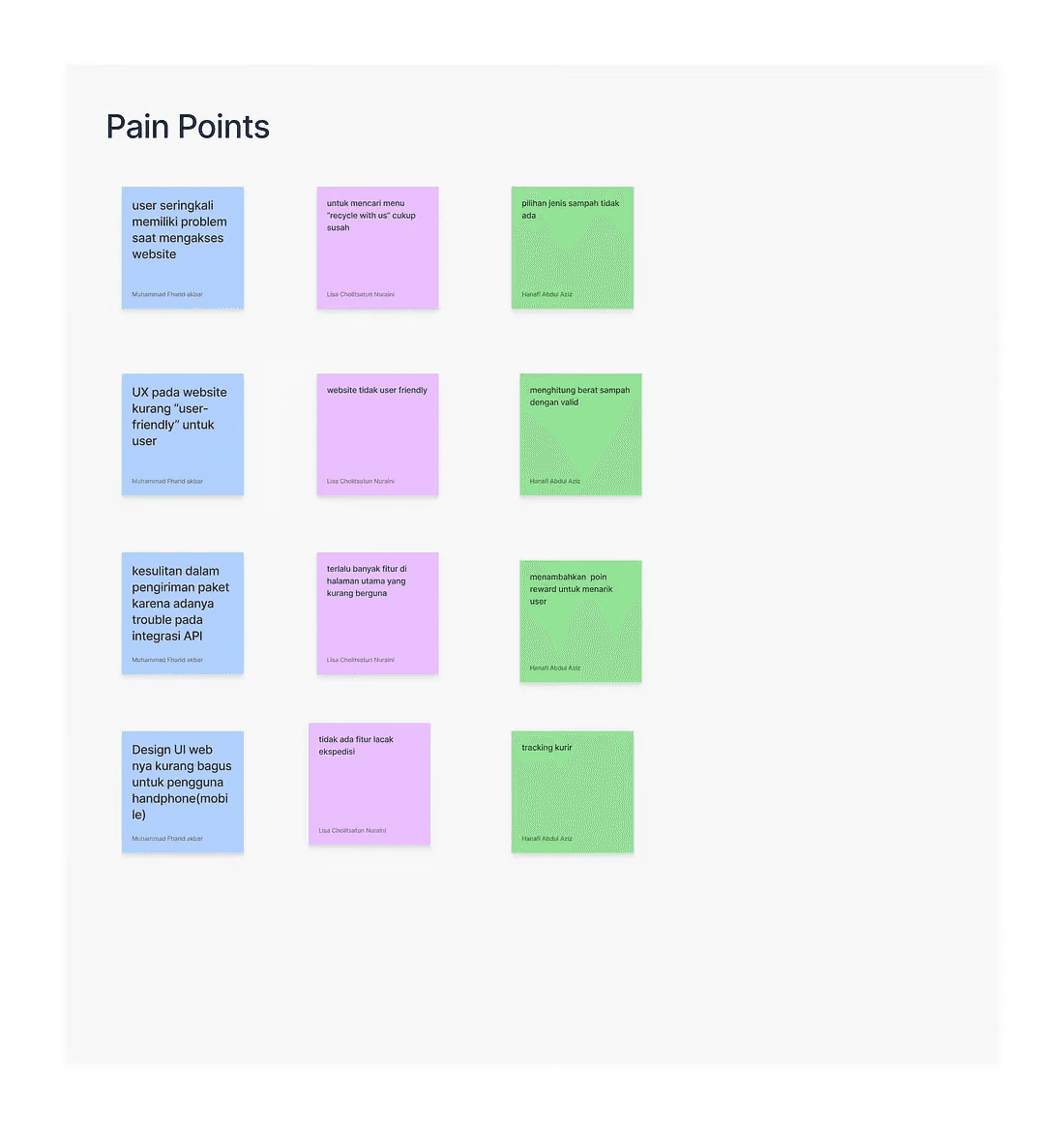
Since we already have the pain point we can create some main solutions / How Might We for the problem of the pain point above. In the How Might We method, we can explore as many ideas as possible and we already have some ideas to choose which one will be the discussion of our problem. To choose, we did it by voting.
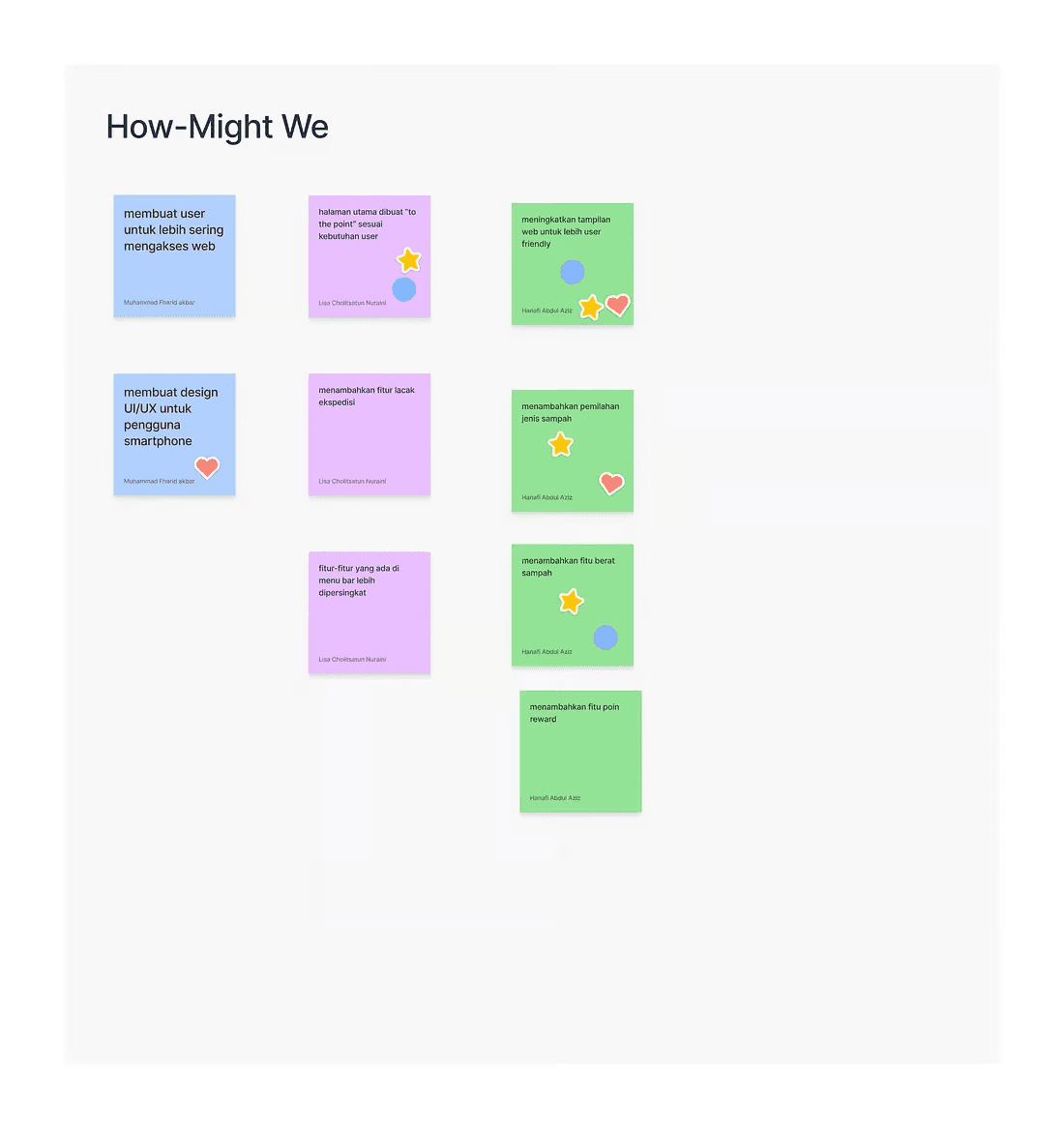
From the voting results above, we raised the issue of "How to improve to be more user-friendly".
Ideate
We did some brainstorming based on How Might We. There are several ideas that we explored for problems according to How Might We.
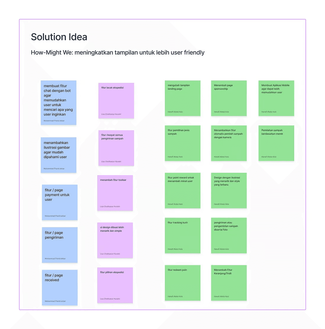
The images above are some of our solution ideas, and then we will start grouping ideas that are almost the same discussion in the Affinity Diagram.

According to the picture above, we have grouped the solution ideas into several groups, namely display, reward, delivery, chat, and waste management. After grouping, we will divide the idea into 4 parts according to priority, such as Do Now, Do Next, Do Last, and Later.

To measure the prioritization of ideas, a comparison between user value and effort is used, where if the user value is high and the effort is low then the idea will be included in do now, and vice versa.
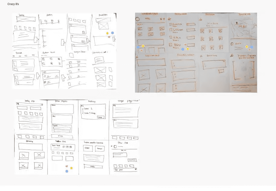
In the next step, to get a rough idea of the ideas we have gotten, we started by making Crazy 8. Crazy 8 work usually takes 8 minutes, as shown below is the Crazy 8 that we have made.
Prototype
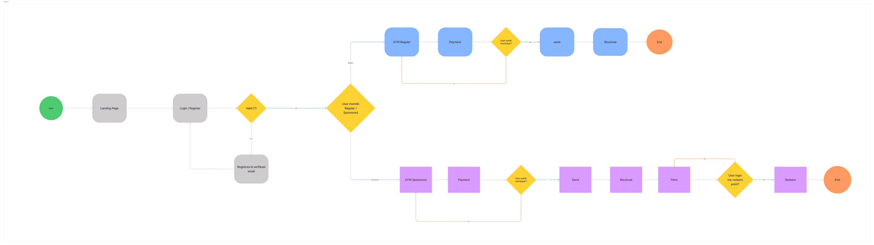
After getting a picture of each member's crazy 8, we proceeded to create a task flow and wireframe taken from images that were close to the initial problem.
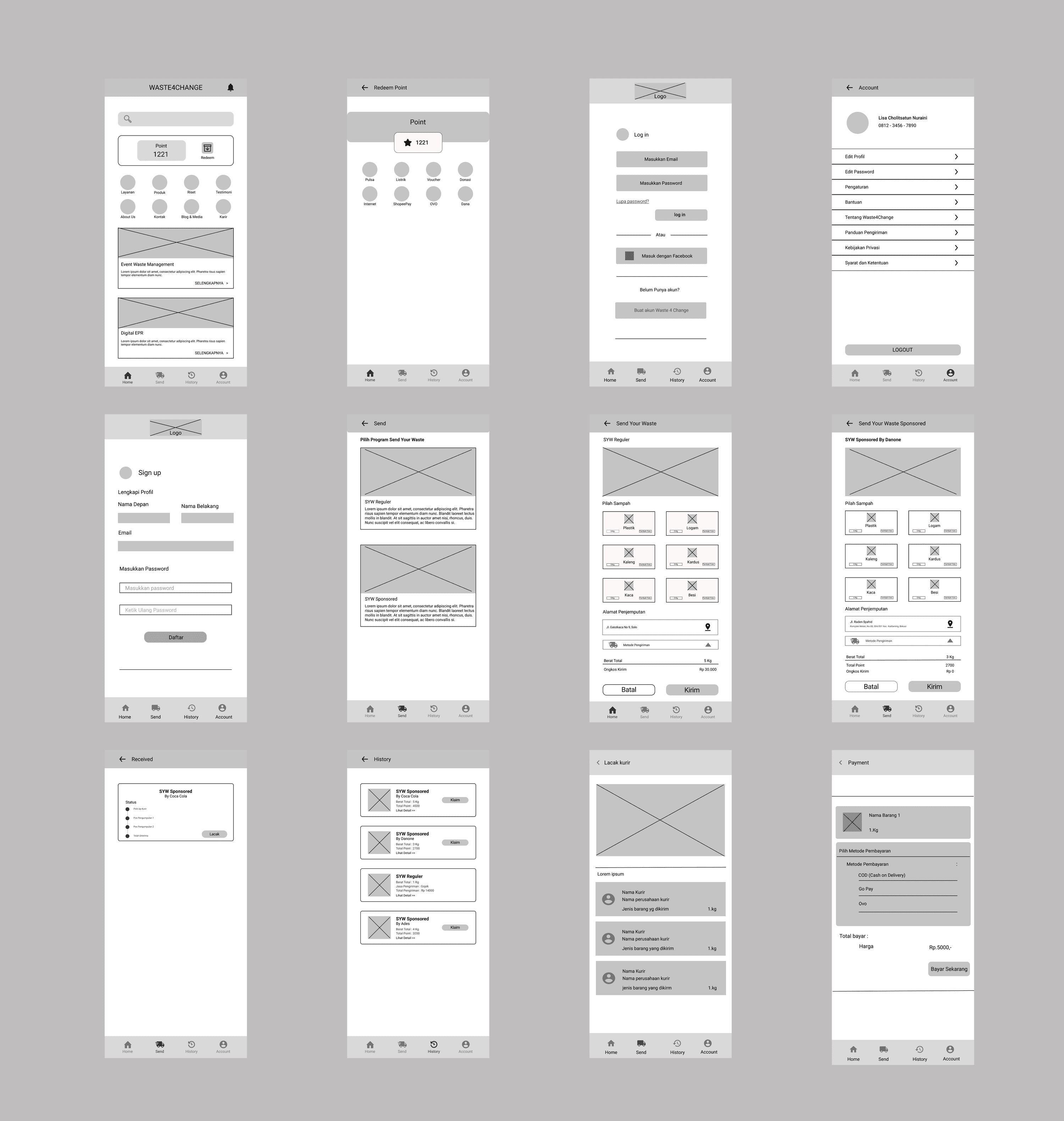
In the last step of the design process, after the wireframe is created and we have an overview, we start to create a display with high fidelity. Here we work together to create the UI display and the components.
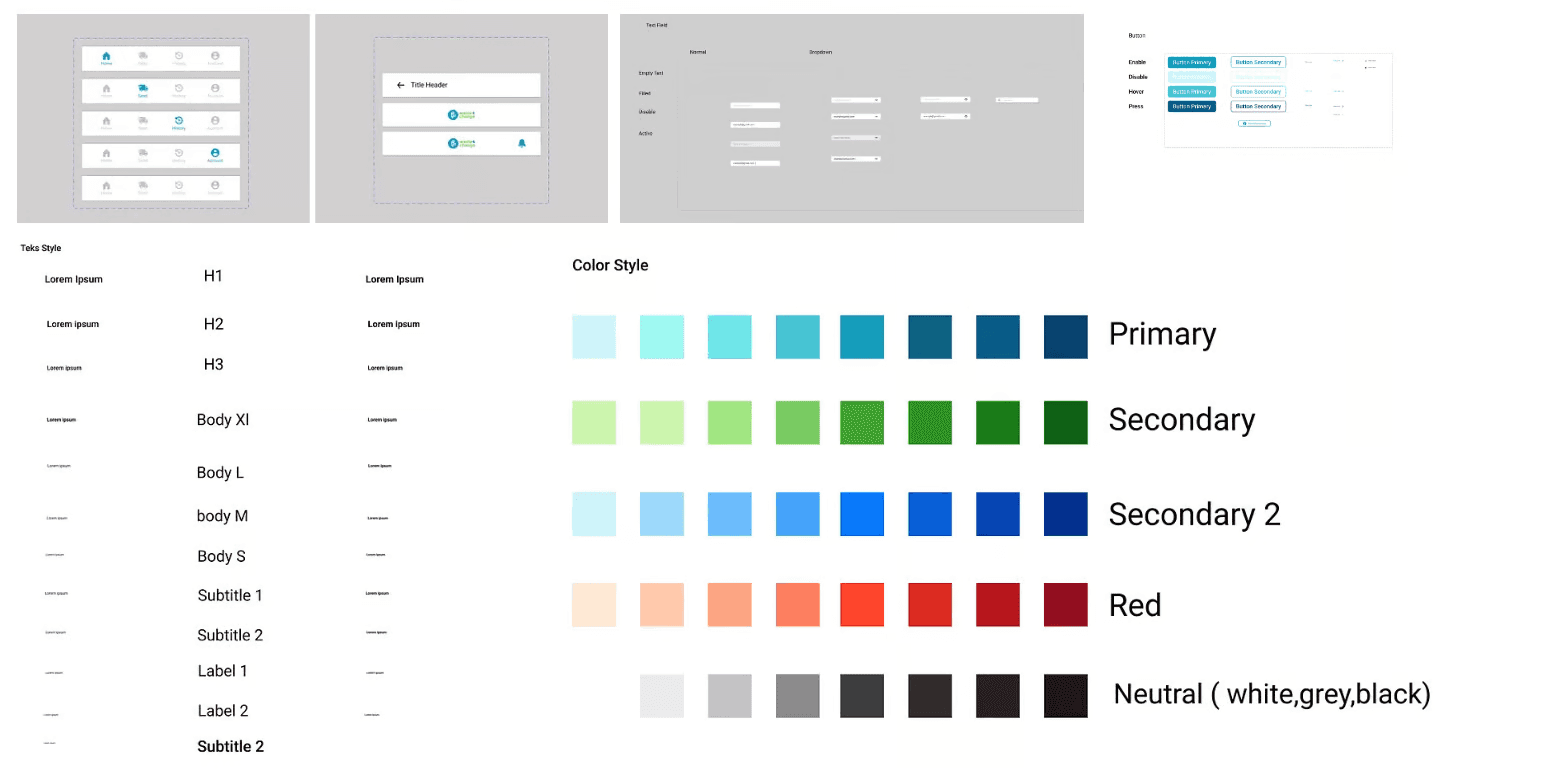
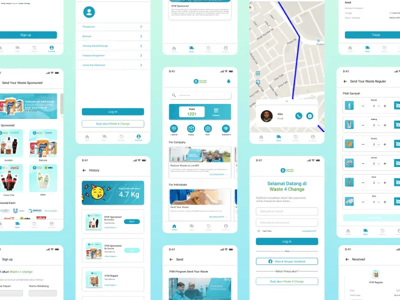
To see the prototype, CLICK HERE
Test
After several steps are taken, there is one step that we think is no less important, where at this step we can get many perspectives from users who will try the results of our redesign. For this reason, we carried out the testing stage by showing the results of our prototype.
In this case, we asked for help from Salwa Shofia, 24 years old, a housewife. We focus on several things, including Task 1, namely the Log In and Sign Up pages. Task 2 on the SYW selection page, Task 3 on the Product Overview, and finally we asked Kak Salwa for an assessment of the Single Ease Question.
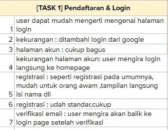
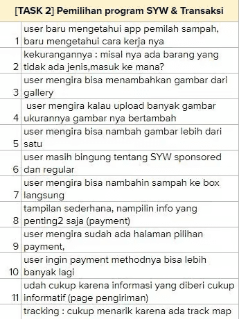
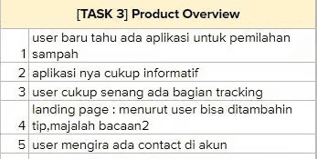
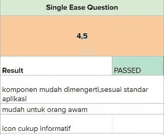
From the results, we get an overall score of 4.5 out of 5 with notes The components are easy to understand and according to application standards, easy for ordinary people, and the icon is quite informative. With this, it can be concluded and made possible that our redesign will get an above-average score.
Conclusions:
The conclusion that I can give from this redesign process is, from the initial problem, Waste4change received many questions about using the web app and problems with shipping, it could be because there were no on-point features on the web app. The new feature Send Your Waste program can make it easier for users to use the web app and shipping.
In that case, we provide several solutions, among which we raise How Might We to improve the appearance of the web app, by going through the design process we can produce several new pages on the Landing Page there are reward points, create a send page to select the SYW program, a history page to see the packages we have sent, and add a tracking system to track our packages.
Further Recommendations:
The recommendation that I can add for the future is the creation of a mobile application for Waste4Change so that it can more widely reach people from several backgrounds and ages. Can further expand the promotion so that more people know about Waste4Change.
Concluding Remarks
This case study really helped me and my friends to learn about UI/UX, even though our results are still far from expected we learned a lot from this case study. There is so much knowledge that we get from here, learning about process, cooperation, and responsibility. I would like to say a big thank you to
All the mentor team who guided us.
Kak Sarah always gives us feedback and always looks cheerful every weekend.
Salwa Shofia as a tester.